Metrics #
Without metrics, we would have no way of knowing how far the agents have progressed. Inspecting the game play of 288 agents is not just time consuming, it’s expensive. Videos consume valuable CPU and disk space to render. However, generating a few metrics are way smaller and easier and can provide data in real time.
For metrics writing, we had two sinks: Weights and Biases (Wandb) and a live map visualization Peter Whidden stood up for this effort. Without metrics, we never would have made any logical improvements, we’d only be guessing.
The Live Map #

A screenshot of the livemap.
The live map is a really simple addition from the developer side. In a wrapper per agent, we open a websocket to a service Peter is hosting and we send the agent’s coordinates over the websocket. We can leave it open during the day. We can check it out whenever. It also provided us a valuable way of seeing if new code we wrote was properly working. It was the first place we looked when evaluating a running experiment.
Weights and Biases (Wandb) #
Charts #
Charts provided an invaluable way for us to understand the timeline of progress and understand how fast the agent was capable of achieving tasks.
For example, we could look at a badge count metric to see how long it would take on average for an agent to get a badge. Fun fact: with wild battles disabled, we can acquire badge 1 in only 10 minutes.
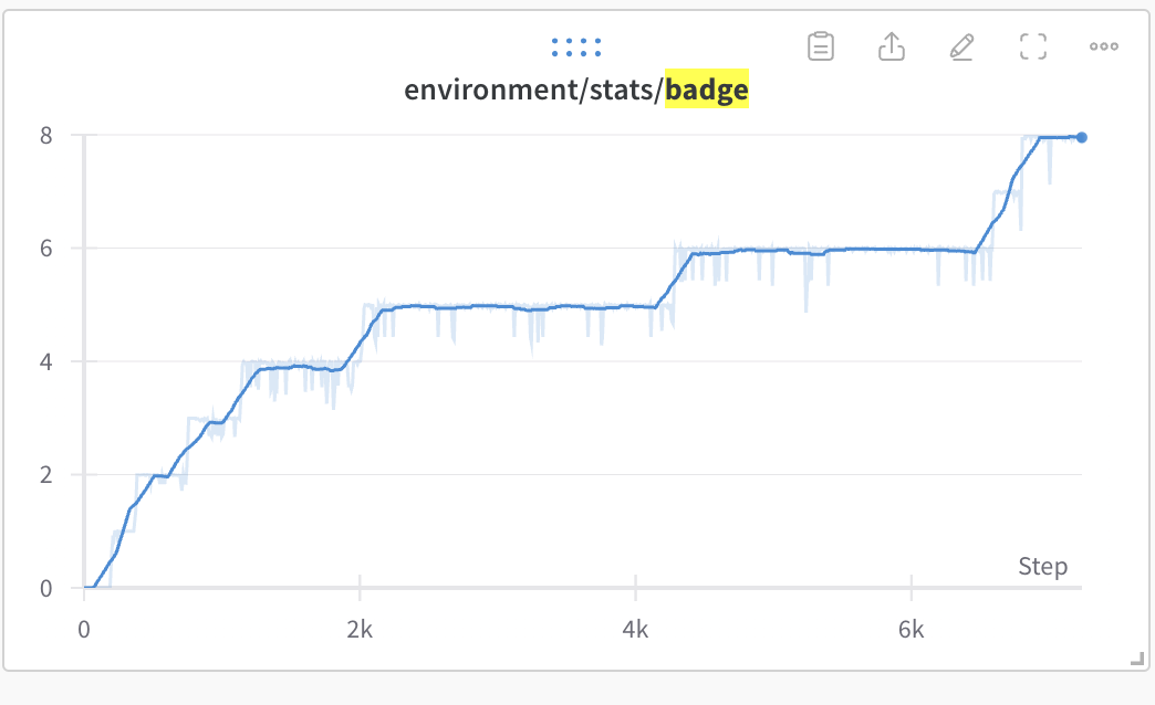
An example metric. With this plot, we could track the the agents’ overall game progress.
Or we could see how many events the agent has finished.
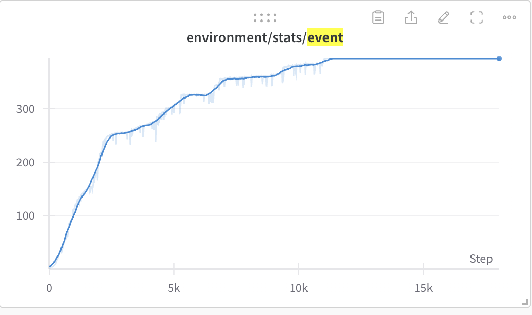
An example metric. With this plot, we could track the the agents’ overall game progress.
We could see if our pokecenter healing reward was finally tuned correctly.
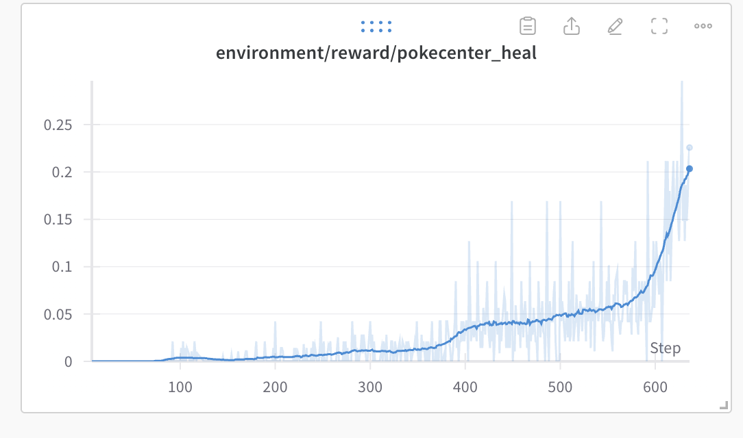
An example metric. With this plot, we could track how often the agents were using the Pokecenter.
We also kept track of the current party all agents had. The party table provided information that would only otherwise have by measuring gift Pokémon event completion. It also sometimes showed some cool gameplay occurrences:
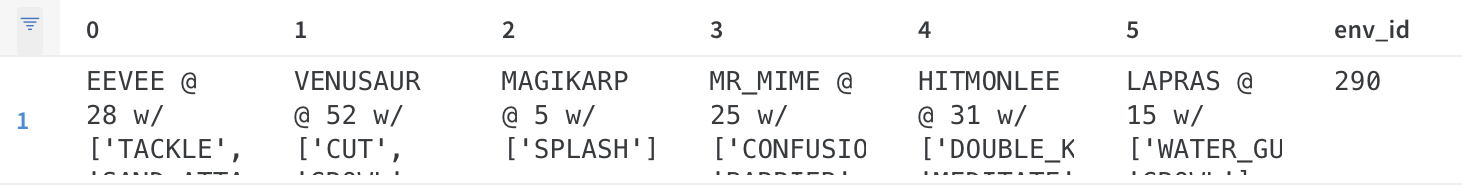
An example party from one run. Notably, the player has a Mr. Mime.
For example, to get a Mr. Mime, the player must obtain an Abra (extremely difficult to catch unless you can obtain enough winning at the Game Corner to buy one) and then perform an in-game trade. We’ve seen runs with Gyarados, tons of Safari Zone Pokémon and more!
The Map Overlay #

A screenshot of a heatmap on Wandb mid-experiment.
Joseph Suarez at PufferAI also wrote a nifty heatmap of where the agent has visited during the experiment. We’ve made modifications since to show where the agent has visited during the episode. The map provided us a way to see where the agents were focusing effort when the live map was too hard to follow. Blue meant fewer agents visited a coordinate, Red meant many agents visited a coordinate.
The heatmap showed some interesting behavior from the agents. For example, it clued us in as to how
- The agents would not focus on maximizing exploration in the Safari Zone.
- The agents’ exploiting of the hidden object reward (mostly through gambling).
- The agents’ preference to avoid battles (as a way to not lose exploration reward possibilities for a mini-episode).

A screenshot of a heatmap on Wandb mid-experiment while the agent is lost in the Safari Zone.
Sometimes the heatmap would also clue us into “routes” the agents’ policy would collapse to. For example, when we mis-weighted tree cutting rewards, the heatmap pointed out that the agents’ would optimize for a route that would maximize their ability to CUT trees in a mini-episode.

A screenshot of a heatmap on Wandb mid-experiment where the agent is fixated on cutting multiple trees in a loop.
The map also showed us more intelligent routing from the agents like when the agents found the optimal path through Rock Tunnel (wild battles were disabled for this run).

A screenshot of a heatmap on Wandb mid-experiment after the agent learned the fastest route through Rock Tunnel.